The UFC Has Unveiled Their Brand New Logo

Are you ready to have your minds blown away by the new look of the UFC logo?
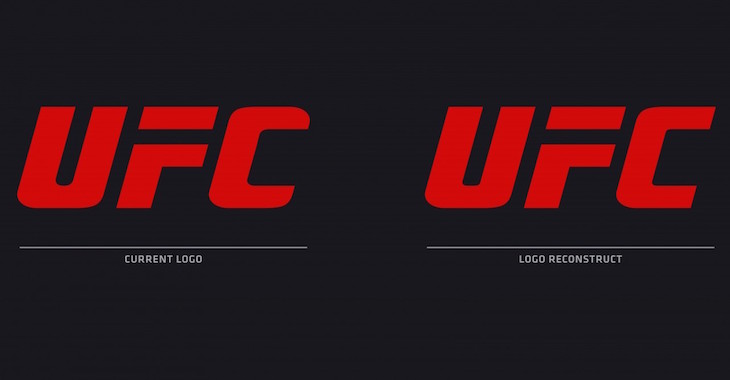
Take a deep breath and look below to see the new logo, compared to the old one:
Exactly. Did you even spot the difference? Apparently all the UFC wanted to do was shave off the strange rounded section of the C. The sad thing is they probably spent a lot of money just to have that slight modification done.
According to The Washington Post, the UFC plans on doing a lot of small changes like this in the near future, with things like TV broadcast graphics and poster designs etc.
Is this the start of a new era?
Kings Of Volume — Punches In Bunches With Nate Diaz And Richard Perez
This article appeared first on BJPENN.COM
Topics:
UFC NEWS


